Showing posts with label Urban Decay. Show all posts

Thursday, 24 May 2018

BREAKING BEAUTY BOUNDARIES - BEAUTY CHALLENGE AT HOUSE OF FRASER

Photography in this post by Kirsty Smith at Intu Chapelfield.

When at the Beauty Lock-In at House of Fraser, I heard Pippa - the owner of Plain Speaking PR - make comments towards Urban Decay saying that she wouldn't be able to shop there because it was aimed towards a younger audience. In my head I began to question why she thought that, but she is in no way alone in that opinion. My mum, who is older that Pippa but a mum alike, also thought the same. She stuck to what she knows and only recently started getting into brands like Urban Decay, where their marketing is obviously aimed towards younger women with bold makeup - which isn't the majority. When Pippa made that comment it made me a little sad, because I knew that there'd be plenty of products for her to use, but I also understood that it could be intimidating to even take a look.

We are all guilty for sticking to what we know. Even myself. I use bright, bold, daring colours and shapes when it comes to my makeup because 1, I love colour, and 2, to give the illusion that I'm confident. I'd rarely strip my face down to a natural look with minimal foundation and eye shadow because honestly, I'd feel ugly. I wouldn't be confident enough to rock a simple makeup look as I wouldn't have anything to hide behind and I am often envious of seeing fresh faced women who look gorgeous rocking what they've got. And that's what it all comes down to - Confidence. Recently a lovely lady pulled me aside saying she loved my yellow makeup and that 'not everyone could pull that off and I wish I could!' - but why not? Again, confidence. 

So out of this small comment that Pippa made I told her that she absolutely could shop at Urban Decay and that the Heat Palette would look divine on her and later in the night we had a brain wave. Let's challenge Urban Decay along side a brand that's a contrast to them, such as Bobbi Brown, to create a look on a 20 something and a 40 something with each brand using the same products on each of us showing that makeup and style isn't restricted by age, but by our own confidence. We really need to get into a mind set where if we like something, we wear it, regardless of us thinking that it's for 'younger people' or 'that wouldn't suit me'. Dismissing ideas before even taking a look stops us from inspiring ourselves - And I need to stop doing that.
Bare faced and ready to go!

When me and Pippa met at Costa before we arrived at House of Fraser, we both complimented each other on how nice we looked in minimal makeup which was a little confidence boost for both of us before we got going. When going in I was looking forward to getting my makeup done at Bobbi Brown as I am not used to giving myself a glowy natural look and I couldn't wait to see what they'd pull out the bag. After a little talk with Tasmin from Urban Decay and Lottie from Bobbi Brown me and Pippa had picked out the products we wanted to keep the same for our looks and then we got stuck in. Pippa headed over to Urban Decay first with me getting my makeup done at Bobbi Brown. 
The lovely Lottie doing my base.

Lottie is absolutely stunning with every glance back up at her involved a dorky comment from me complimenting something about her. It's important that us women appreciate and inspire each other. Lottie used the Intensive Skin Serum Foundation on my skin which I loved. It made me look so healthy and wasn't heavy on the skin.  She set the foundation with the Nude Finish Illuminated Powder and added the Pastel Peach Brightening Brick (Which I am very in love with and haven't stopped thinking about since) to finish my base. For the eyes she used the Sparkle Stick in Molton Bronze, which she also used on Pippa, with a simple winged liner and mascara. For the lips she popped on the Crushed Lips Colour in  Sazan Nude with the Lip Pencil in Cocoa to give me the perfect nude pout. 
The lipstick from Bobbi Brown
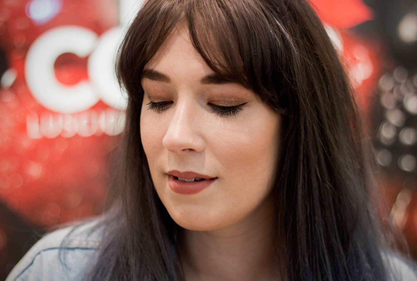
My final Bobbi Brown look.

The lovely photographer Kirsty bounced back from me and Pippa and every time she came over I quizzed her about Pippa's makeup as I was so excited to see what she looked like. When my makeup was done I glanced in the mirror and loved it. It was strange seeing myself all made up but in a very natural way. It got me thinking about toning down my makeup once in a while as I really liked how I looked. I would really recommend Lottie from Bobbi Brown if you want your makeup doing (the winged liner she did on me was bomb) as every step of the makeup she catered to me and made sure that what she was doing was what I wanted. She was incredibly attentive and made me look and feel beautiful.

When I hoped off my chair I scurried over to Pippa, as her Urban Decay transformation was what I was looking forward to most. And oh my GOODNESS did she look amazing. She has the most beautiful blue eyes, so when Tasmin used the Heat Palette on her it made her eyes look absolutely incredible, you can see for yourself below. 
Pippa looking beautiful at Urban Decay. I mean, look at those baby blues?!

Pippa looked beautiful. She definitely looked like she could head out! It was really lovely seeing her in a brand she would never have thought to have tried and I was thrilled when she said she liked how she looked. It was then time to swap over and see what the lovely ladies could do with the same products they'd just used but on the other client.
I'd never gotten my makeup done at Urban Decay, so I was very excited to finally get it done by my all time favourite brand. Tasmin was the lovely lady that had the job of making me look ready for the town and when I saw how perfect and beautiful she looked, I couldn't wait for her to work her magic. I'm familiar with most of the products so it was nice to talk about our favourites and our long lost loves  - the discontinued products. Tasmin was incredibly lovely, easy to talk to and made me feel at ease. I understand that getting your makeup done at counters can be intimidating, but Tasmin wasn't that at all. I would recommend her for and bold looks that you're after (After a glance at her Facebook page she's also very very good at prom makeup).

She used the same products as she did on Pippa, the Naked Heat Palette (You can actually see my review for that here) and Space Cowboy Moondust for the eyes. She begun with the eyes, unlike Lottie at Bobbi Brown, because for more intense looks there's a chance of fall out. This means nothing gets on your face and ruin your foundation! She did a halo eye on me keeping the mattes outside and a pop of Space Cowboy on the centre. Because there wasn't all the Urban Decay testers that Tasmin wanted, she improvised with other products in Urban Decay but for the brows so had to grab a brow product from Benefit as unfortunately UD didn't have my shade. At this time of year I have very dry under eyes, and as I had taken my makeup of twice already my eyes were noticeably irritated. Tasmin did an absolute amazing job at making sure they were hydrated and didn't look cakey and what an amazing job she did. Look how flawless my under eyes look! She used the Naked Skin Foundation on me to keep me looking matte and flawless,  partnered with the Naked Skin Powder to keep it all locked in. She used the Sin Afterglow Highlighting Palette to finish of the cheeks and the new Hi-Fi Shine Ultra Cushion Lipgloss (Try saying that twice as fast) on the lips for the glossiest of glosses. I loved the final look and the smokey dark eyes is a staple of mine, so I felt right at home.
So overall, what did we think? We completely jumped into something that wasn't what we were used to, and we both came out surprising ourselves. I could pull off the more natural makeup that I wasn't used to, and Pippa looked absolutely gorgeous all glammed up at Urban Decay. In other words, try something new. That bright, pink lipstick that you wish you could pull off every time you pass it? Stop beating yourself down - try it - I dare you. You may just surprise yourself. You can read Pippa's side on her blog here. A massive thank you to Hannah, Tasmin and Lottie at HoF for making this challenge happen, and special thanks to Kirsty Smith for the photos.


Tuesday, 31 October 2017

URBAN DECAY NAKED HEAT PALETTE REVIEW AND SWATCHES

When I first saw this palette I think I was the only person on the planet that wasn't too bothered about getting it. I had no intention of purchasing it until my friend convinced me that it was beautiful and that I needed it in my life. She's someone that I look up to and has insane makeup knowledge, so I trusted her and invested in a palette that I had no idea would become a staple in my life, and part of my daily makeup routine. It's obvious that if you don't like warm tones that this palette is not for you, but if you love warm hues or just want to get a palette for the autumn days, I urge you to check the Naked Heat palette out.
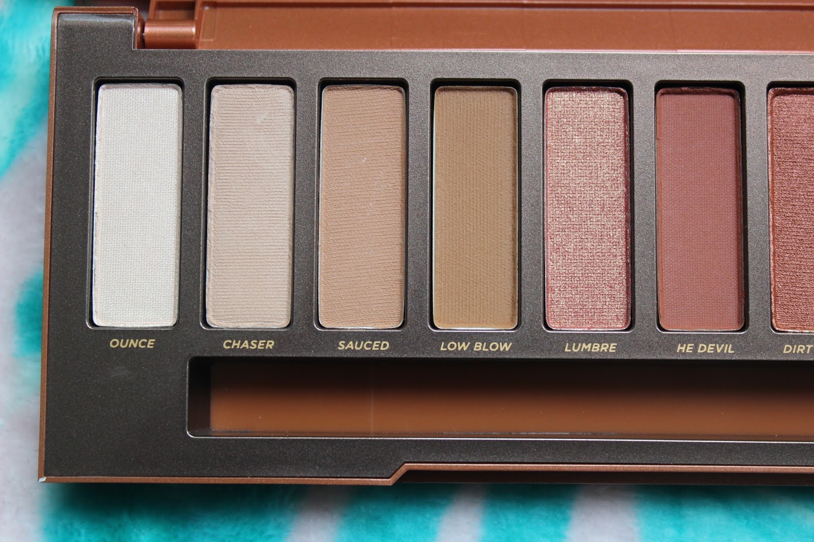
The warm hued palette comes with 12 shades tucked away in breathtaking packing. Easily the most stunning looking Naked palette yet. I absolutely adore the packing. I prefer this over the tin cases or the velvet case from the Naked 1, 2 & 3. The plastic feels more luxurious and the double layer front shows how much thought they've put into it.
L-R, Ounce, Chaser, Sauced, Low Blow, Lumbre and He Devil.
L-R, Dirty Talk, Scorched, Cayenne, En Fuego, Ashes amd Ember.

If I'm being completely honest, there's only one shade in this palette that I do not like with all the rest being insanely blendable, pigmented and gorgeous. I know the Urban Decay formula well after getting almost every palette since the second book of shadows, so I knew what to expect. Again, Urban Decay hasn't disappointed. Keep reading for a quick sentence or two on each shade.

Ounce - A soft cream shade with a hint of shimmer which isn't too noticeable. Makes a really pretty highlight on pale princesses.
Chaser - This shade is great if you're super pale like me and needs a barely there shade in the crease for a quick wake-me-up look.
Sauced - Is a great transition shade or swept over the lid. Super pigmented.
Low Blow - I like using this to darken up Sauced as a transition shade. Again like all matte shades in this palette, it's really pigmented.
Lumre - This is a super pretty shimmery peachy red which I love in the centre of the lid.
He Devil - A gorgeous dark red hued brown which looks intense all over the lid and blended out.
Dirty Talk - A really velvety shadow that has great pigmentation and blends well over the lid.
Sorched - This has the same constancy of Dirty Talk and catches the light beautifully.
Cayenne - A shade that's pretty similar to He Devil, only slightly darker and more brown.
En Fuego -  This is a favourite for me, and I love taking my outer corners to the next level with this shade.
Ashes - Pigmented and perfect for darkening the lash line.
Ember - I don't like this shade. This is the only shade in the palette that I had difficulty with. It didn't blend how I wanted and it seemed to get really muddy. The only way I can use this is using a light transition shade and patting this onto the lid with no blending.
Since getting this I reach for this almost daily and if I'm in a rush and need a palette that has it all for an easy autumn look, this is it. I almost never reach for my other Naked palettes so it's really refreshing to use this in almost every look and it gets me excited for future Naked palettes. All the shades are pigmented and beautiful - so if you like the colours in this palette, it's going to be an investment. 

You can pick this beauty up from Debenhams
here for £39.50.
Thanks for reading!


Wednesday, 6 July 2016

URBAN DECAY ALICE IN WONDERLAND THROUGH THE LOOKING GLASS PALETTE - REVIEW AND SWATCH

I'm a tad late to the Alice in Wonderland party, but I just had to do a review on this beautiful palette. The previous Alice in Wonderland Urban Decay palette is one of two limited edition palettes I hadn't gotten hold of, so I wasn't going to let this masterpiece slip through my hands! I reluctantly refused the lipsticks due to money, but I would've had them a heartbeat. I picked this up a few weeks ago at my local House of Fraser. Let's start on the exterior. How beautiful is the packaging! Potentially one of the most beautiful yet, even though it's gone back to its old school cardboard packaging. The rainbow kaleidoscope pattern which is made of flowers and butterflies is perfection, and looks stunning with the mirror and logo in the middle.
Once opened, but before getting into the palette, there's a large decorative mirror with the words 'We're All Mad Here' printed on the mirror. As gorgeous as the mirror is, it's not overly practical and when using this palette I tend to use a big mirror or a previous Vice palette. When you open up the top there's also two doors which open up to a 3D butterfly which flutters its wings when you open the doors. It's a really lovely touch and adds a little magic and mystery to the palette, which suits it so well. I think Urban Decay had absolutely nailed the packaging. I thought I was going to be slightly upset about the cardboard packaging, but because of it's bright, interesting patterns and pretty motifs I can forgive and forget. What I also love about this is you can pull the palette straight out, so you've not got your mirror or butterfly flapping around.
When you open the palette section up, it's almost 3D looking due to the white and black blocks. However its as flat as any other palette! Unlike many palettes I have, the groups of colours go diagonally, representing a certain theme or character. There are some absolute killers in this palette so I'm so happy I picked it up. The brush is also so dainty and pretty and gets a not of use too. I find the shorter brush is good for packing on colour, and the fluffy side does a good job at blending.
 ALICE
L-R - Looking Glass, Reflection, Dormouse and Metamorphosis.

LOOKING GLASS - Looking Glass is a pretty pale shade which is great for the pale princess out there. This is a great base colour and perfect all over and then adding Chessboard in the crease. Looking Glass has a smooth application and applies as a sheeny, soft pearl.
REFLECTION - This is such a pretty colour! It looks so delicate washed over the whole lid giving a peachy pop of colour. This is a matte shade with great colour payoff.
DORMOUSE - Is another one of my to go to crease shades. It has a satin finish and blends well! It's a great all-round brown shade that I constantly go to when I need a brown. 
METAMORPHOSIS - This pretty periwinkle shade is a shade I've not seen before, and it was one of the reasons I went for this palette. It seems to have a mint/blue shimmer that is hardly there when on the lids, but adds a little brightness. I adore this on the bottom lash line!
 MADHATTER
L-R - Hatter, Gone Mad, Paradox and Cake.

HATTER - Hatter is faultless. It has the perfect satin texture with insane pigmentation. I wish I wore greens as this is the perfect one. I might try popping this on the lower lash line with a bold black liner for a crazy yet wearable look. I need to use this shade!
GONE MAD - I'm so happy that this dark purple shade has good pigmentation! It's a really lovely deep purple shade which has great colour pay off and is super buttery. One of the most pigmented shades in the palette - Good job Urban Decay!
PARADOX - I love peachy/orange shades at the moment and this is going to be a much loved shade! Like almost all in the palette it applies well, has great pigmentation and amazing colour.
CAKE - I can appreciate this this has crazy pigmentation and buttery texture, but the colour isn't my cup of tea. The shade looks beautiful and if you love pink, you'll adore this.
 MIRANA
L-R - Lily, Duchess, Kingdom and Chessboard.

LILY - Lily is perfection - It was so hard to photograph so the picture doesn't do it justice! Similar to the shifting shades in the Urban Decay Oz Glinda palette, this has a pretty pink shimmery shift. However this is far more buttery and pigmented. I just adore this all over the lid or in the corners. On my pale complexion it looks so delicate. I would never go for a pink shade, but this really brings out the blue in my eyes in a subtle, interesting way.
DUCHESS - This again is very similar to Lily, with the fact that it has a shimmery pink shift. This is a really pretty peach shade and looks gorgeous all over the lid with Chessboard in the crease. Because it has that pink shift to it it makes it look really interesting on the lids. An absolute winner.
KINGDOM - This is a really pretty tan shade which is great over the lid. It's a really lovely buttery shade that goes well on the lids.
CHESSBOARD - This matte brown comes off more orange hued on the lids than in the swatch. This is my most used shade. I'll use this in the creases or under my eyes to make the blue in my eyes pop. It's beautiful to blend and so easy to apply. Easily my to-go-to brown shade at the moment.

 IRACEBETH
L-R - Heads Will Roll, Bandersnatch, Salazen Gum and Royal Flush.

HEADS WILL ROLL - I've worn this a fair few times now, and I love it! This palette has really made me experiment with colour which is so cool. A palette should inspire, and this one does just that. This bright aqua shade is a satin shade with fine shimmer. This is a dream to blend and applies effortlessly.
BANDERSNATCH - This is another unique shade which is one of the reasons I went for this palette. It's so beautiful! It's a unusual navy shade that isn't too dark that you mistake it for black when on the lids. It's a matte shade and blends well.
SALAZEN GUM - Oh boy. Where do I begin. Holy moly. Isn't this one of the most perfect things you've ever seen?! This metallic finish shade is to die for. It's buttery, it goes on like a dream, the colour and pigmentation is out of this world. I have only good things to say about this gorgeous shade!
ROYAL FLUSH - This frosty shade is perfect for all over the lid or the inner corners. I tried using this as a brow bone highlight, but for me the sparkle is a little too chunky to achieve a barely there but bright highlight. Still a pretty shade to sweep over the lids.

TIME
L-R - Time, Dream On, Chronosphere and Mirror.

TIME - Time has insane pigmentation and shimmer. This is one of my favourites in the palette, and I'll try more smokey eyes because of it. This shade is a dark navy with pretty bright navy shimmer. This is lovely as an alternate to a black smokey eye or great for darkening up a blue eyeshadow in the outer corners.
DREAM ON - I don't like this shade at all. I don't know if it's the unusual lilac hue that I can't get to look nice on my eyes or the sheerness of it. I'm not 100% sure if I'll reach for this again or try to make it work. A little disappointing, but the other shades in this palette forgives it.
CHRONOSPHERE - This is a really creamy deep golden brown shade. This is great partnered up with Kingdom. Great pigmentation and looks pretty on the lid!
MIRROR - I love this grey taupey shade! I love this all over the lid with a bit of Time to make it more smokey. It's a really unique shade and applies well.

Overall I am so happy I picked up this palette. This is a really awesome all round palette and you can achieve so many different looks. From very natural matte eyes to crazy colours and dark smokey eyes, this is a look for everyone. You can get this for £43, although it may be sold out in many places now. 

Wednesday, 22 June 2016

URBAN DECAY VICE 4 - REVIEW AND SWATCH

Having owned the majority of the Urban Decay palettes since the 2nd Book of Shadows, I have become increasingly obsessed with the packaging and the ever-changing shadow formula. The Vice palette always come around a few months before the Christmas season, so I always leave space for it on my Christmas list. I prefer Urban Decay shadows compared to any other brand, even the likes of Mac and Benefit. From everyday wear to the parties I always gravitate towards my Urban Decay palettes. This is potentially my favourite UD Palette to date, and definitely my most preferred Vice palette. I depotted my first and second Vice Palettes into a Z-Palette, but I can justify doing it to the Vice 3 or this beautiful new addition. You can see the Vice 3 review here, the Vice 1 review here (It is my first blog post, so bare that in mind!) and Vice 2 review here.
The packaging has outdone any other UD palette I've seen. I adore the rainbow shattered appearance with the raised mirrored layer. There's also a snug little bag with matches the palette which is a lovely touch. The Vice 3 was the first Vice Palette to come with a matching makeup bag so it was nice to see the trend carried through to another Vice. The inside is the same layout as all Vice palettes. 4 rows of 5 shadows in the usual layout and an added brush which I always enjoy. I have so many Vice/Naked brushes, it's getting ridiculous. That said, they're handy brushes to have and something I always keep in my kit no matter how much I dislike double ended brushes. I'd describe this palette as a easy everyday palette which sees you though to the evening and the experimental looks. There's soft neutrals, gorgeous grungy metallics and amazing, glittering brights. I am in love. You can get some gorgeous pretty looks with this palette, but I am all for grungy eyes at the moment.
L-R: Bones, Grip, Deadbeat, Beat Down and Pandemonium.

BONES - On my skin tone, you can't really make it out. That said, it's a really pretty delicate shade. It has a soft shimmery shift to it that's slightly pearly that looks really gorgeous. It doesn't look obviously shimmery in the pan and comes off more matte, but when applied you can see the slight sheen it has.
GRIP - Is another shade that comes across more soft when swatched. It's a grey/taupe shade with a slight sparkle in it. It blends well, but not a shade I tend to go for. You could throw this on all over for a darker everyday look that's not too dark for daily wear.
DEADBEAT - I hadn't thought about wearing this until I swatched it and saw how gorgeous this shade really is. It's a metallic black which some serious glitter. I wore this out to a party for a grungy twist on the smokey eye and I can't get enough. 
BEAT DOWN - Reminds me of Fortune from the Makeup Revolution Unicorn Unite palette which you can see here - But on closer inspection Beat Down is more shimmery and buttery in comparison. It's a lovely shimmery purple with a darker purple throughout. 
PANDEMONIUM - This shade is a grey/purple colour with a crazy metalic sheen. This is really pretty to add some delicate colour to a black smokey eye.
L-R: Framed, Fast Ball, 1985, Underhand and Harlot.

FRAMED - This is a pretty delicate peach shade. It's not quite matte, and has more of a satin finish. When I look at this shade it reminds me of gorgeous bridesmaid dresses! It's really easy to blend and perfect to use all over the lid for a quick look.
FAST BALL - I wasn't that bothered about this shade until I swatched it. Wowza. It has a lovely coral to hot pink shift which I really like. This is really nice paired with Bitter, and it blends like a dream. 
1985 - Not my most used shade, but that doesn't mean it's not beautiful. It's really soft to play with, but hot pink really isn't my colour. If you're into your pink shades, this one is lovely to use.
UNDERHAND - Is so so beautiful. It's a red brown which I'm really into at the moment. I love using reddish shades with my blue hair and I think it compliments me really well. 
HARLOT - I adore how delicate this shade is. It s a pretty silvery pinkish purple. I love this for evening meals out! It gives a hint of glitz and glamour without it being too much. Blends perfectly and is super buttery.
L-R: Discreet, Grasshopper, C-Note, Arctic and Robbery.

DISCREET - Is a barely-there matte violet grey shade. This is perfect for creating a subtle smokey eye partnered with a blended out grey liner.
GRASSHOPPER - Is a grassy green metallic shade with plenty of shimmer. The pigmentation of this is unbeatable! Like the others, it's super easy to blend and has a buttery texture.
C-NOTE - Instantly reminds me of money! This looks lovely with Robbery. Because of it being a green colour and a shade I tend to avoid, because it's more muted it works well with shimmery brown shades.
ARCTIC - Is a pretty metallic iced teal shade. I try to avoid many blue hues as my hair is blue/green, but because of the subtly yet boldness of this shade, it works really well.
ROBBERY - Is it gold? Is it bronze? I love how this is still a metal shade, yet seems to be unique and a shade I've not seen in the UD world before. It's easy to blend as always.
L-R: Bitter, Flame, Low, Crowbar and Delete.

BITTER - This is one of my favourite shades, and I always used it either all over or in the crease paired with Flame. It's so buttery, easy to blend and the pigmentation is flawless. Easily one of my to go to shades at the moment!
FLAME - This is super shimmery, and nothing like I've seen before! It's a gorgeous shimmery coral with amazing white gold shift. To keep my shadow as shimmery as possible, I pair it with a Mac Paint pot, usually Mooncake, as they cling to shimmery/glittery shades really well. This is one of my favourite shades! 
LOW - Is beautiful. It's a brown matte base with loads of silver glitter! It's not chunky at all so it glides on well, but it isn't without it's fall out! It's easily avoidable by doing your foundation after the eyes, but it can be a hassle.
CROWBAR - Is a browny dark green with gold shimmer and glitter. The glitter didn't transfer as well as I thought it would from pan to eyes which was a shame.
DELETE - Is a dark satin matte brown which is a dream to blend! I use it smudged around my eyes for a quick subtle grunge look! 

Overall this is my favourite Vice palette to date, and Urban Decay have outdone themselves once again. I've always been a huge fan of the Vice palettes and I cannot wait to see what the next one will look like - It'll be hard to top this! You can create bright and bold looks, soft and shimmery or dark and daring with this versatile palette. You can still get this online from Debenhams for £43 here.

Thanks for reading!


Sunday, 13 March 2016

VICE 3 URBAN DECAY PALETTE SWATCH AND REVIEW


I took these photos before Christmas 2014 but never got around to doing the swatches because life has a habit of getting in the way. Before I post my Vice 4 review, I wanted to make sure I had done this, so I had an archive of all the Vice palettes and so I could make references when needed! It's no longer available to buy unfortunately, but the Urban Decay palettes have a habit of popping up on websites every now and then. I always reach for this palette when I'm doing my plum looks as the plums in this palette are to die for. There are some gorgeous shimmers as well, so let's just get started!
The Vice palettes always come with a double ended brush.
L-R - Truth, Dragon, Vanity, Alien and Last Sin.

TRUTH - I tend to use this light pink matte shade all over the lids to give my eyes a little bit of life. This shade is very powdery and has a tendency to puff everywhere, but it's still a great shade nevertheless. The shade is great or us pale princesses!
DRAGON - I'm not a huge fan of greens so I don't tend to use this. It's great for costume looks though as it's a really good metallic green.
VANITY - Is gorgeous! I adore applying this shade as it's a dream. It's a really pretty deep metallic plum that's great as an alternative to a black smokey eye if you want to dabble in a bit of colour.
ALIEN - I want this as a blush and I want it now. I LOVE this shade so much. I used this shade in my Pink and Gold Valetine look, as it's so easy to blend and looks gorgeous. It's a pink shade with a gold shift which looks beautiful.
LAST SIN - I like this golden metallic shade, but it has so much fall out on me. I couldn't get along with it and never reach for it, and when I do I instantly regret it. It's such a shame as it looks gorgeous in the pan.
L-R - Undone, Freeze, Lucky, Alchemy and Angel.

UNDONE - Is a pretty pale beige matte. It's a lovely transition shade for us pale girls, so I tend to use to to blend out a brown smokey eye. It blends really well - No faults for this shade!
FREEZE - I find it hard making this shade look good on me without looking like a kid in the 90's. It's an okay shade and has okay pigmentation.
LUCKY - This is so beautiful! It looks gorgeous on the eye, and always makes my blue eyes pop. It's buttery and gorgeous!
ALCHEMY - This is one of my most used in the palettes a year on from getting it as it's so unique. The pigmentation is perfection, and the colour is divine. I love this reddish plum metallic shade!
ANGEL - I really reach for this shade as I find it to be on the same formula as Last Sin unfortunately. It is a pretty shade, but I don't really wear silvery/gold metallics.
L-R - Downfall, Heroine, Reign, Bondage and Defy.

DOWNFALL - I found this super buttery to work with! I love this warm buttery brown matte shade and works as a great crease shade on me. It's easy to blend too and would work as a good transition shade.
HEROINE - I use this quite often as an alternative to a black eyeliner when I'm doing a slight smokey eye. I love that this is a shimmery matte and not just matte as it brings it to life. I used it in my Navy Winged Eyeshadow look if you want to see it in action!
REIGN - This gorgeous golden brown shimmery shade is so easy to blend. It's great all over the lid and swept beneath the eye for an easy, classy smokey eye.
BONDAGE - I love this dark plum shimmery goodness. I love using this as a dark smokey eye, and used it in a Copper and Purple Punky Smokey Eye, so go check Bondage and Sonic in action there. It blends so well and the colour pay off is brilliant. I love this shade!
DEFY - Another shade I didn't get on with and don't reach out for. I just think it's a flat colour and doesn't really do anything exciting for me.
L-R - DTF, Brokedown, Bobby Dazzle, Sonic and Revolver.

DTF - (Naughty shade name!) is delicate and classy. I love this violet grey matte shade with small shimmer throughout. The pay off is amazing and looks great on the lids on its own once it's blended out. I've not seen a shade similar to this.
BROKEDOWN - This shade has no faults and works a treat, It's a pretty brownish golden shade which looks lovely paired up with a creamy metallic shade.
BOBBY DAZZLE - I just don't like this shade. That's not to say it's not good, I just don't like it. It's too weird. I tried applying this shimmery white shade in the corners of my eyes, or as a highlight but I just can't get on with it. 
SONIC - One of my favourites! As I said before, I used it in my copper and purple eye look which you can see here, and when I wear this shade I always get asked what it is. This coppery reddish pink has insane colour pay off and blends beautifully. What's not to love?
REVOLVER - This shade is an almost black/dark grey metallic shade. It's perfect for creating metallic smokey eyes and I love wearing silver glitter over the top of this shade. 

Overall, I love this palette - and was my favourite Vice palette until the Vice 4 stole my heart. Although nothing can beat Sonic...
Keep an eye out for any future Vice palettes as they're completely worth the money, and you're never stumped for creativity. You have everything you need for day time, night time and creative looks. You can see the Vice 1 swatches here (It was my first blog post so forgive me.) and the Vice 2 here. Thanks for reading!